Discovery & Information Architecture
We map your audiences, their tasks and your commercial goals into a sitemap and page hierarchy - so the structure is decided before a single screen is designed.

A website is the one piece of brand communication people choose to spend time inside. That makes design a commercial decision as much as an aesthetic one. We start with what the site has to achieve - enquiries, sign-ups, sales, credibility with a specific buyer - and design outward from there, so every layout choice is answerable to something.
The craft still matters. Typography, colour, spacing, motion and photography are what make a brand feel like itself on screen. We combine that with information architecture, responsive behaviour and performance discipline, so the site holds up on a mid-range Android on patchy 4G as well as it does in the pitch deck.
From first wireframe to launch-ready build, with the details that decide whether a site converts.
We map your audiences, their tasks and your commercial goals into a sitemap and page hierarchy - so the structure is decided before a single screen is designed.
Layouts, type, colour and imagery built from your brand rather than a bought template - a design system with real components, not a set of one-off pages.
Navigation, page flow, form design and calls to action shaped around how people actually move through a site, so visitors reach the thing they came for.
Designed and tested across desktop, tablet and mobile, with sensible contrast, focus states, alt text and keyboard navigation as standard rather than a retrofit.
Image strategy, font loading, script discipline and caching handled during design, because speed is far cheaper to build in than to bolt on.
Clean URL structure, heading hierarchy, metadata, schema and crawlable navigation built in from the start, so the new site does not reset your search visibility.
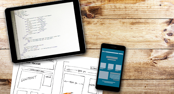
Plenty of agencies can make a site look good. The harder part is making it look good and still do its job three years and four content owners later.

Structured, collaborative and deliberately front-loaded - the expensive changes are the ones made after build starts, so we make the decisions early.
Discovery: your goals, audiences, competitors and the constraints we are designing within.
Architecture: sitemap, page templates and content requirements agreed before visual design begins.
Wireframes: structure and hierarchy signed off in grey, so feedback is about function not colour.
Visual design: a full design system - type scale, colour, components, states - applied across templates.
Build and QA: responsive implementation, cross-browser and device testing, performance and accessibility passes.
Launch and iterate: analytics, redirects, search console setup, then improvement based on real behaviour.
 ASK THE BEE · LIVE
LIVE · AI ASSISTANT
ASK THE BEE · LIVE
LIVE · AI ASSISTANT